Author Archives: Satina - The Aquarian Avatar

About Satina - The Aquarian Avatar

I Am the long-awaited Avatar of The Aquarian Age, finally WIDE AWAKE and ready to free humanity from the bonds of psycho-spiritual slavery. I AM here to PHYSICALLY manifest The REAL Age of Aquarius. I AM most likely Not The Messiah You Were Expecting, but I AM THE ONE who is here to get this party started! Come join me! Because it's ON, fellow Gods and Goddesses! www.theindigomission.wordpress.com Blessings!

New year, new blog name, new youtube channel!

Happy new year to everyone!

If your life is *anything* like mine, change has become your only constant. So I’m dropping in here to share my newest changes with anyone who might still be interested.

When I chose the name Flighty Artist, for both my blog and my Youtube channel, I had the intention of sort of ‘reclaiming’ a phrase that was always kind of an insult in my world. But as I began to take my explorations of self through art more and more seriously, the name began to feel less and less comfortable. And with this new year, my entire life is refocusing around the quest for wholeness through art, so I really felt I needed a new name.

I am discontinuing this blog (but leaving it up) and am moving to a new one called The Artful Journey.

I am also creating a new Youtube channel under the same name, where I plan to start doing my very first videos very soon.

Thank you to everyone who has given me love and support here over the past few years!

~Satina

Leave a comment

Filed under Uncategorized

I’m back! With a junk mail art journal page.

So okay.  Sorry I’ve been gone.  My life went into a blender and hasn’t really come out yet.  Gist of it is, I’m giving up most of my possessions to hit the road.  I’m a spiritual counselor and am in total obedience to Spirit’s Call, and it’s calling me and my partner and daughter to Mt. Shasta.  But we have to give up nearly everything we own and arrive with just what fits in the car.  For my partner, that means some really tough choices going through her books.  She’s a writer with lots of novels that are like friends.  For me, it means paring down my art supplies, which are also precious.  We can store just what will fit in an old car that we’re leaving behind with my grandma, and we’re going to ship a few boxes ahead of us to the temporary furnished cottage, but all the rest is being sold or donated.

Life’s been beyond wild.  Beyond stressful.  Beyond crazy.  I don’t wanna talk about it really.  And artwise, except for a few paintings around the solstice, (which I will share in their own post) I haven’t been doing anything.  Oh, and I definitely decided the C.A.P.I project was all wrong for me, since I’m getting ready to live on the road and answer a Call to a whole new life and purpose.  So, anyway, the last few weeks have been spent deciding and re-deciding what I absolutely MUST carry with me in a portable studio, what I absolutely MUST ship ahead to the cottage we’re renting, what I can stuff into the old car, and what I can sell or give away.  Gah.  I’m SO not a hoarder, but when it comes to art supplies, I pretty much want it ALL.

I’ll do another post on what I decide on for my portable studio, as well as my little travel art journaling kit that fits in my bag, since I know I LOVE those posts and hey, you might be curious.

For now, going through my supplies has made me nostalgic for the days when I was arting or art journaling every day, and today I took the day’s junk mail and made an art journal page.  Something about making art with garbage gets my muse going when nothing else does.

This is done with watercolor paint, Sharpie poster paint markers, Sakura gel pens, and a Uniball Signo, and junk mail and trash off the floor of the car.  I need to do this more often.  It really lets my inner child out and helps me get past my insecurities.  It also shows me what main things I reach for every time I make anything.  Hope you enjoy!

DSCN0888

P.S.  Anyone wanna buy some used art supplies?

2 Comments

Filed under Art Journal Pages

The C.A.P.I. Project

I have joined a new project designed by Milliande of Milliande’s Art Community for Women (but this project of hers is open to men too), called C.A.P.I., which stands for Create Art Portfolio Ideas. The purpose of the project is to do focused assignments in order to define your personal artistic style. I didn’t think that appealed to me at first, but then I reconsidered it (pondered it a bit, you might say) and decided it does. You can find out all about the project on Milliande’s website.

It involves keeping 6 different Portfolios that all have different purposes.  But Milliande does things a bit differently, which is where stepping outside my comfort zone already begins!

1.  Pondering Journal – written journal entries and collected information on the Pondering Prompts  (I was surprised to see she recommends a loose folder into which you put papers, printouts, etc. rather than a bound journal.)

2.  Raw Sketchbook – place to keep all the rough sketches, ideas, inspirations  (She actually uses a huge variety of scratch and art papers clipped onto a clipboard for this!)

3.  Observational Studies Sketchbook – place to do the Observational Studies assignments  (She recommends a regular sketchbook or mixed media journal.)

4.  Gathering Portfolio – a place to keep visual imagery collected according to Gathering Portfolio Prompts  (She recommends just a file folder for this.)

5.  Bottom of My Handbag Portfolio – a place to throw things when I don’t have time to file or make decisions about them  (She recommends a file folder for this as well.)

6.  Style Toolkit – what will result from all of this, a focused, cohesive set of tools that define my personal Artistic Style  (She uses a professional artist presentation portfolio for this.)

So here is what I have put together to start:

DSCN0821

I have three file folders, one for Gathering, one for Pondering, and one for Bottom of My Handbag, all lovely recycled brown file folders that I used correction fluid on to get them ready for their new jobs, plus a Raw Sketchbook and a new Observational Studies sketchbook. Now for my observations on this so far:

After doing an hour or so of rampant magazine tearing, I already know I’m going to need a big, expandable file for the Gathering Portfolio!  I think it’s because of the thick paper they use in National Geographic, Somerset Studios, and Artist Magazine, as well as the calendar and tourist books I’ve been ripping up.  Anyway, for the Raw Sketchbook, for now I am just continuing to use my regular sketchbook that I made the raw canvas cover for.  It’s where I already record any art, craft, or design ideas I find or come up with.  I cannot imagine using a clipboard for a sketchbook, but I am intrigued by her use of all different kinds and sizes of paper, so I’m thinking of making a book out of those to use for this project as a compromise that works better for me.  I do worry that I’m not staying totally true to her ideas, which I talk about below, but it just doesn’t feel like a clipboard is going to work for me.  The small, hardbound brown sketchbook on top is a new one I bought for myself with Christmas money ($4 at Michael’s) and will be where I do my Observational Studies assignments.  I also have a new mixed media spiral journal I can switch to if the assignments require heavier paper.  I want to shop for just the right portfolio to use for my Toolkit, so I don’t have that yet.  I have to say that I’ve been collecting ‘stuff I don’t have time to organize or make a decision on’ for a few months already, and it’s in a big garbage bag.  So I’m not sure how well this little folder will do for that.  LOL!  Ah, see that’s why I need help with the whole ‘focus’ thing…

In the rest of this blog entry, I am going to explore the first 3 Pondering Journal assignment questions.  My answers will explain why I decided to do this after all.

 Pondering Prompt 1:

 What Defines Art Style?

To me, when someone has a style, they have a line quality that is all theirs. They can achieve it nearly every single time they want to, so there is an aliveness to their lines.  They are more effortless and thus able to contain more soul and less strain.  There is a sense of “on-purposeness” to their art. They usually also have a select palette of colors and a favorite medium that you can expect from them. They usually also have a distinctive set of objects and symbols that you see recurring in their work, which tell us more about what is important to them as people in the world. They also have a consistent energy or attitude about life in general that comes through everything or nearly everything you see them do.  (I say ‘see them do’ because of course artists are always doing all kinds of art we don’t see them do, that they don’t choose to share or sell, etc.)

 Pondering Prompt 2:

 Why Would I Want an Artistic Style?

I want to have a line that I can create at will, that feels like I’m putting a little bit of my true energy on the page or canvas.  I want a safe place to return to when I want to express something. I want the marks I make to be more by choice than chance. I feel that now, my marks are by chance and then I make choices as to what to keep, discard, cover, change, etc. I have all types of line quality and haven’t yet discovered which one feels the most like me. I would like to find a medium that most aligns with my personal energy with which I can consistently make physical whatever inspirations channel through me.

I think a big problem I will have is that I’m not consistently anything. I have severe mood swings and random physical pain and energy levels which makes every day or even every moment of every day up for grabs as far as how I will feel or what I will want or be able to do. I don’t see how I can express a consistent energy in my art when I can’t experience it in my life. But this answer isn’t about what I feel I can have, it’s about what I want and why, and that’s what I want.  While I’m wishing, I’d like it in the rest of my life as well.

 Pondering Prompt 3:

 Accountability

I am only accountable to myself and can quit anytime I want or skip or change those things I don’t feel are right for me.  But I want to give this a real shot. I want to push through discomfort and resistance and try new things and discover new things within this given structure. I am hoping that if I push myself beyond my comfort zone, I will find more joy and peace and fulfillment in my art (and thus my life) than I currently have. I am always one to reinvent the wheel, which is natural for me because I’m a designer at heart, but I think that also deprives me of truly sharing the experiences of others. With this, I want to make a conscious effort to copy what Milliande and the others are doing, whether it’s comfortable or not, so that I experience more of what they’re experiencing.

That’s it so far. I think it will work best for me to do my Pondering Journal writing assignments here on my blog, as well as copying and pasting the replies of others to benefit from their input. When I get my new printer in a week or two, I will print them to keep in the actual Pondering Journal, in keeping with Milliande’s directions.

(Okay, so this is what happened with the old color inkjet printer:  I lost the power cord in the last move, and it ran out of all 4 inks over a year ago anyway and I’ve just been using the black and white laser printer for utilitarian printing.  The cost of replacing everything is about equal to buying a new, much better printer, so that’s what I’m doing.  I feel bad that it’s wasteful because the last time I used it, it worked fine, but the new printer will print much better images AND the ink will be cheaper so how can I not go this way?  It really sucks that donating it isn’t even a gift to anyone because I would be donating them something that will cost THEM more money to get working and not be as good as what they could spend that money on instead.  Quite a reality to encounter.  Such is technology I guess!)

4 Comments

Filed under CAPI

I made a “Girl’s Survival Kit”

Okay, I saw this tutorial on Pinterest:  http://tidymom.net/2011/survival-kit/  And I thought it was absolutely awesome.  So I made one and sent it off in a swap!  It is soooo easy, and I got everything I needed for it, except the potholder, at the dollar store!  I LOVE dollar store crafts.  They did have potholders there that night, but they were a bit small.  I was at Honks today and they have a bigger one that’s dark blue with plaid, kinda butch and cool.  But I got a set of 2 simple red potholders at Shopko for $2 and that’s what I used.  All you do is use a zigzag stitch to sew in 10 snack-size zipper baggies, then fill the baggies with little essentials.  You sew on a button, and the potholders even already have the loop and are ready to go!  Here’s mine:

Image

Here it is closed up with a pin cushion on a ribbon wrapped around it, which is how I sent it.  I didn’t get a picture of it without that, I’m afraid.  The pin cushion can be tied onto your sewing machine, by the way.  Or around your wrist, or you can wear it as a pendant.  And the round middle of the flower, the stuffed part, is stuffed with steel wool to keep pins sharp.  But anyway…back to the Survival Kit, which I would rename, a “Just In Case.”  Get it?  Because it’s kind of a case full of things to have on hand just in case.  Yeah, so anyway…

Image

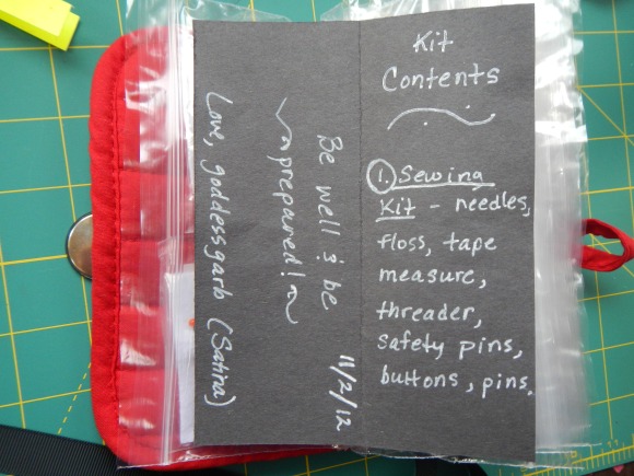
You can see how the loop fastens around the button and makes a handy little clutch.  And I made a list of everything that was packed into it (and it was stuffed!):

Image

Image

I think this would make a unique, super easy, and super useful gift for anybody.  I plan to make more, that’s for sure!  I need one for myself for starters!

1 Comment

Filed under Artsy-Craftsy Misc., Dollar Store Crafts, Sewing

Super Easy DIY “Washi” or deco (decorative) tape Tutorial

Okay, so I saw some tutorials on doing your own washi tape or deco tape, on YouTube, and I loved the idea, but no one had a good way to make it have the peel off backing, nor did they have an easy way to store the tape.  So I thought, why not spread the tape out on waxed or parchment paper to decorate it, then leave it on there, cutting off each strip and either rolling it up or folding it up?  So I tried it!  And I figured I’d snap some pics so I could do a simple tute on it, too.

Image

What you’ll need:

Parchment paper (or waxed, though I don’t have any right now and haven’t tried it yet)

Masking tape

Acrylic paint

That’s it!  You can use whatever mixed media stuff you want to, to decorate the tapes.  I used Gloss Enamel craft paint, which I love, metallic acrylic paint that I don’t have the pkg for so don’t know the name of, but it’s cheap, and on one I smearked dark brown Inktense Block.  This is such an unfussy project with what I think are pretty spectacular results that you could sit your kid(s) down and have them make you some!

Here are some pictures.  I just laid out parchment paper the width of the workspace I had available. 

Image

I have two kinds of masking tape, a blue painter’s tape that stuck too much to be useful for that, and a regular masking tape from the dollar store.  I stuck down long strips of tape, leaving about oh…3/4 inch between them for messiness and cutting them out after.  (I had painted two strips with gold and copper metallic before I snapped the pic…too fun to stop.)  Oh, and I’ve seen packages of parchment paper at the dollar store lately!  You could totally do this whole project from there.  They have parchment paper, acrylic paints, and masking tape.  Anyway…

Then I painted.  Splotchy, messy, improv, just had fun.  You could do anything you wanted, and you’d still get cool tape.  I didn’t do anything precise, that’s for sure, but you could.  You could stamp words, phrases, delicate designs, be as precise as you want…or you could splash paint everywhere, like me.  Here’s what I ended up with, just messing around:

Image

Then after it dried, I cut between each piece of tape, leaving it on the parchment paper.  I rolled three of them and I folded three of them (and three others still weren’t dry when I did this), then secured both types with paperclips. 

Image

Some people’s storage works with the rolls, but I’ll probably just keep folded ones in ziploc bags, like everything else in my life.  The tape comes off the parchment SUPER easy, and it sticks to the paper just as great as it ever did.  Success.

That’s all there is to it!  Have fun!


Leave a comment

Filed under Tutorials

Art Basics: Composition, 10 Keys to Pleasing the Eye and Mind.

The art journaling and scrapbooking worlds have invited all kinds of wonderful ‘untrained’ artists into the creative world, and I think that’s beyond great!!!  But I’m sad to see that lots of them are struggling with how to make themselves happy with their art due to not having those basics that make the difference in being able to make things that please the eye.  I highly recommend that if you are not happy with your mixed media, art journaling, scrapbooking, cardmaking, or any other visual arts endeavor, that you take a basic art class or read some basic art books, because those basic things can make THE key difference between spending your time and money on art that pleases you and feeling there’s *something* missing but you just can’t put your finger on it.  I know some artists are too impatient and just want to get to making art without learning the basics, and I understand that being a very impatient artist myself.  But I’ve also realized, the more I do art, how much I rely on my basic art training to make stuff that pleases me.  I mostly do it without thinking about it because it’s a part of me now, but this is all stuff I had to learn at some point or another, and I’m realizing that all these new ‘untrained’ artists don’t have that yet.

What about, “Just jump in and start playing with your stuff!”?

I am all for jumping in and experimenting, but I also know that understanding the basics can lead to a much more satisfying outcome.  And that stuff costs money.  If I pay a bunch of money for special materials, I want to know all the bells and whistles of getting the most out of them…then I’ll experiment and see if I can get even more!  After all, the materials were designed for a purpose, made just so they’ll do this or that…and I want to know what makes them special!  I’ll admit, it frustrates me when people who know a lot of about art and supplies tell you to just start playing, because there are things to know about each medium that will make them WAY more fun to play with.  That’s also the reason I want to do more supply reviews.

So yeah, I’m not a professional art teacher or anything, but I did take a year of art school and have since read (and continue to read) tons of art books, plus I’ve been doing art since I was a toddler, and I want to share what I’ve found for anyone who might benefit.  So I’m adding a new Category to my blog for basic art lessons, Art Basics.

Let’s start with the first, and in my opinion, most important.

COMPOSITION

Composition is one of those things that I think is essential to any good piece of visual creativity.  And it’s one of the things I hear new art-makers of all kinds asking about the most.  Composition refers to how elements are composed, or put together, in a work of art, and the usual goal is to strive for a balanced, pleasing composition of elements.

So, here are things I’ve learned (and I feel) about getting a good composition:

1.  Odd Numbers.  The eye likes to see odd numbers of things, not even ones.

2.  Organic Lines.  It likes irregular lines, not super straight, angular ones, although if the point of the painting is to show straight edges, as in architecture, that’s different.

3.  Brains Like to Imagine.  Our brain likes to ‘make things up’ on its own regarding texture, rather than to have it shown everything perfectly.  It likes to see bunnies in the clouds, so to speak (The Confident Creative is where I read that, I think).  That’s what is so pleasing about loose watercolor, as opposed to tight.  Tight doesn’t let our brains imagine enough, it gives us everything and we get bored.  Even a photo where everything is in sharp focus doesn’t give us enough to do and we get bored.

4.  Diagonals, Curves, and Triangles.  The eye likes to follow diagonals and curves rather than boxes.  Triangles draw us in and are the most often used arrangements seen in the classics.

5.  Balance of Light and Dark.  It  likes to see things balanced, weightwise and lightwise.  My teacher called it, “chiaroscuro,” an Italian word, and though I don’t remember what the word means translation-wise, I’ve never ever forgotten the concept.  Again, it was something you see in the old classic works.  I believe it was Caravaggio who was THE master of this.  It breaks down to having darks and lights throughout the painting to keep your eye playing and moving, and varying the size of them so it’s not all static.  If you have a big dark on one side, compensate with two smaller darks on the other, not just another big dark.  Another big dark is also two things rather than three.

6.  Limited Tones.  It likes to see contrasts in tone so it has more to look at, but not too many.  Three main tones are what it’s most comfortable with, a dark, a medium, and a light, so if you can break your image into that, you’ll please the eye more.  An exercise for this is to take your image and use just three tones to depict it, and see if it pleases the eye.

7.  Variable, Balanced Heights.  It likes variable heights, and it likes heights to be balanced somehow, rather than all tall on one side.  So for instance, if you have a tall tree on one side, you will need to compensate with colors or heavy darks or otherwise weigh down the other side so the tree doesn’t tip the painting to that one side or keep the eye from leaving.

8.  Off-Center.  It mostly doesn’t enjoy a horizon right in the center, it prefers it to be higher or lower.  Same with the focal point left to right.  It likes it better off-center, but balanced.  Portraits are usually the exception and are painted exactly in the center, although personally I much prefer ones that are not, where balance is found in other ways, such as a 3/4 view with some shoulder or the body, the face looking into a side background with darks to balance.

9.  Big and Small.  A mixture of small and large shapes is more pleasing, too.  Sometimes I can get a painting or mixed media piece that seems layered and rich and whatever, but the shapes are all the same size so it’s not making me happy.  If my shapes are all little, I try to add some big shapes, and if they’re big or medium, I try to add small.  Sometimes there is a sense of beauty, but not enough little detail, like wearing a pretty outfit but no jewelry…not enough to look at.  So it needs that.

10.  Intuition.  Intuitively speaking, I guess mentally I place the image on a seesaw to see if it balances or if I feel one side would weigh down that side of the seesaw.  Then I use shape, tone, color, line, height, interest etc. to add weight or take it away until it feels like that seasaw would stay horizontal.  I work so that the eye doesn’t stay on one side of the painting or the other, but enjoys both sides, and so that it doesn’t stick in the middle, but moves around.

If you can’t figure out what you don’t like about your piece, maybe looking at these tips will lead you to see which of the above things might need addressed.  I hope this can help you make art that pleases you!

Leave a comment

Filed under Art Basics

Tutorial! My First! DIY craft foam relief stamps!

Okay so yeah, I kinda promised this about…eight or so months ago.  Sorry ’bout that.  But anyway, here’s my little tute on how to make your own super easy craft foam relief stamps.  Now I know I hate it when some craftista says something will be ‘super easy’ and then it takes twelve steps and 35 hours and all kind of weird supplies, so I’m not going there.  I promise.  These are easy.  And all you need to make them is:

Craft foam.  I get mine at the Dollar Tree.

Ballpoint pen.  Mine today is an old giveaway from a title company.

Scissors.  Also from the Dollar Tree, incidentally.

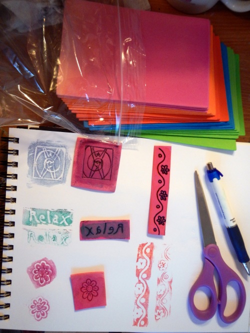
These are the simplest type of stamp to make from the craft foam, in that they are relief, meaning they stamp a block of color with your design in relief (not colored) inside it.  They create a primitive look that I really dig.  You can also make regular stamps by cutting shapes out of foam, but I’ll leave that for another tute.  Other variations are to use different point of ballpoint pens to make finer lines.  This one I’m using is a medium…maybe even a bold, I’m not sure.  I used a fine point for some of the finer lines on the flower stamp I made and it works fine.

So, step 1:

Choose a simple design and use your pen to draw it on your foam.  (I can do a separate tute on how to transfer a design from paper to the foam if there’s enough interest, but for today, we’ll just talk about a simple, off-the-cuff line drawing.)  The pen kinda drags on the foam, so you may have to press very lightly and go over your lines a bit to get the ink to lay down.  I decided to try a border stamp for this one:

Step 2:

Go over your original lines with the pen again and again, one section at a time, pressing the groove way down into the foam.  If you just go over the lines, you’ll start sinking into the foam, and it’s best to let it happen gradually like that at first, so you get a smooth line.  With a fine point, you may even poke/cut all the way through, and that’s fine.  It will even help you see where your design is from the other side.  Here’s my border, pressed down into the foam:

Step 3:

Cut out your stamp.  Leave this to last so that you can move the bigger piece of foam around while doing your drawing.  Oh, and make sure you don’t press into it with your fingernails while holding it.  See the little impressions left above.  Oops.

Your stamp is ready!  You can mount it on a piece of cardboard or something else, if you want.  I made a set of letters and put each one on a square of cardboard.  To stamp, I’ve used these with ink, watercolor paint, Inktense Blocks, and acrylic paint, and it’s all fun.  I’ll use some Inktense Blocks here.  I use mine like pan watercolor.  I like them because once they’re painted on, they don’t reactivate again like regular watercolors.  Instead, they act like permanent ink.  Great for working over with other stuff.  Anyway, I just use a brush (in fact, an old makeup brush, to be exact) to paint the color on:


Heavy or light, you’ll have to experiment.  I did it pretty pretty heavy on this one:

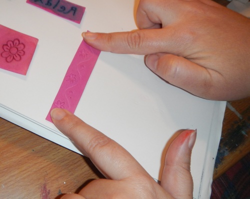
…and you’ll see I got a less-than-clear impression.  With the first press, I just put the foam down and apply very light pressure, holding the stamp down with one finger while smoothing to the other end with the other, without moving the foam:

See how you can see the lines through the foam?  It’s great, because you know where your design is, like with clear acrylic stamps.  Here’s the impression I got with that loaded up paint:

I would have gotten more detail with less paint.  Oh well.  For me, stamping is about adding interesting line and shape, and I like it.  I’d definitely experiment with different media and lay it on more lightly to try to get a finer design. What you stamp on also matters.  This is just sketch paper, with a little roughness to it.  Smoother paper works better for finer impressions.

For the second impression, I press the stamp differently, to get some of the paint from inside the lines, which gives me a different impression from the same stamp.  I press harder:

And get a different impression:

I like that.  I often like the last impression where I squeeze that last bit of paint/ink out of the stamp the best!  On the page at the top of the tute, I made one of each kind of impression with two of the other three homemade stamps I use for examples.  Like I said above,  if there is interest, I’ll try to do a separate tute on transferring a design from paper to foam, like for more detailed designs and words.  For now, keep in mind that to do words, you have to write them backwards for them to stamp forward.

Have fun and experiment!  I hope I made this clear, since it’s my first time doing a tutorial for anything!  I’d love for you to leave a link back to a picture of a stamp made with this tute in the comments.

3 Comments

Filed under Artsy-Craftsy Misc., Tutorials

Some Favorite YouTube Art Journaling Video Reviews

One of the most…okay, THE most inspirational thing, creatively, to me is to see other people’s process.  So I spend a lot of time watching YouTube videos of people in the actual journaling (or painting, or sewing, etc.) process, as well as watching tutorials to get different ideas, techniques, info on media, and perspectives.  I thought it might be fun if I shared some of the most recent videos that have inspired me to get going again:

Leslie Herger is my art journaling guru.  She owns www.artjournaling.ning.com  (a community for art journalers) and www.putitonpaper.org (a new art journaling zine) as well as www.comfortableshoesstudio.com (her blog) and has done some wonderful videos for beginning art journalers.  Her wise words, “It’s about PROCESS not PRODUCT,” ring through my mind over and over to keep me brave.  Here is a link to one that really helped me let go of some fear:  http://www.youtube.com/watch?v=Ch7WtRsssmU&feature=share&list=PL6gXONIXKk-Yxc8dB4q1EGCQ13YBWYtA-

Judith Cassel-Mamet is new to me and hasn’t done many videos, but I really loved this one for again, getting over the fear, and for new ideas on how to get started.  I also love her concept of “adventure journaling” because it also focuses on the process and adventure of the journaling, not the product.  http://www.youtube.com/watch?v=KzDYXg0jsxw&feature=share&list=PL6gXONIXKk-Yxc8dB4q1EGCQ13YBWYtA-

Spookypaperdoll has done a wonderful vid on 10 types of art journals.  I love it because it gives me all kinds of ideas on what to do next, what to do instead, what to do when I’m tired of doing one kind, etc.  http://www.youtube.com/watch?v=iBu8OBVyFtc&feature=share&list=PL6gXONIXKk-Yxc8dB4q1EGCQ13YBWYtA-

Donna Downey is a new artist to me, but I LOVE her Inspiration Wednesdays.  She records her process, edits it for content and time (unlike those streamed-live vids that are two hours long and include letting the cat out, etc.), and posts it so we can see how a page can go from blank…to train wreck…to masterpiece!  Honestly, it was watching about four of these that finally got me into the studio space to make some art.  And they kept me going when I was halfway through and thinking, “Oh my god…what have I done…this sucks.  LOL!”  http://www.youtube.com/watch?v=HQRoYQTkBXc&feature=share&list=PL6gXONIXKk-Yxc8dB4q1EGCQ13YBWYtA-

To anyone struggling with this, I hope these help.  I’ll start a new Category of YouTube Faves since I’m always finding new ones.  And someday, soon…maybe I’ll even do my own.  (yikes)  =:o  But first, a photo tutorial of how to make your own craft foam stamps.  Next post!

2 Comments

Filed under YouTube Faves

Art Journaling again!

Well, I’m doin’ it again.  I’ve been slurping up art journaling videos on youtube, (you can see what I like on my Flighty Artist Channel) especially my favorites Leslie Herger, Diana Trout, and Jennibellie, and I took the plunge today and spilled some myself.  I just kept Leslie’s (Comfortable Shoes)’s words in my head:  “It’s about process, not product.”  And Diana Trout’s Journal Spilling advice to, “Keep moving, don’t think.”  And I ended with a new avatar image for my craftster account!  I was totally about the process, though, and didn’t even think of using it for that myself, even though the whole thing started by me just randomly stamping with my goddessgarb stamp all over a page.  When it was nearly done, my partner came and saw it and immediately suggested I use it for my avatar, which is perfect, since the username comes from there.  Here it is:

Mixed media in Strathmore Visual Journal.  Homemade stamps, a custom stamp, purchased stamp, alphabet stamps and white pigment ink, Sakura Glaze pen, Bic White Out pen, white Uniball Sigmo gel pen, Krylon gold paint marker, Inktense Blocks, Crayola Twist-Up Metallic Crayons, and I think a Sharpie red Poster Paint marker.  Plus a couple of ribbon scraps and a couple of stamps I got in swaps that I particularly liked.  Oh, and black paint sprayed through a mister and alphabet stencil.  And blue painter’s tape.

It was FUN.  I nearly rinsed my paint brush in my chai tea, but disaster was averted at the very last second.

3 Comments

Filed under Art Journal Pages, Mixed Media

Pen and Ink sketch, Oil Pastel sketch

I’m totally cheating on the faces thing, but I figure I am doing 29 faces, just not within the 29 days, so I’ll categorize them that way to make them easy to find.

I decided to experiment with my Portfolio water-soluble oil pastels and do a face yesterday.  I enjoyed using them!  I can’t believe how great they are for the price.  They’re very creamy, and even though they only make 24 colors, they’re great ones and make for a very versatile palette, in my opinion.  They would work for portrait, landscape, and bright abstract or graphic stuff.  I liked being able to work and re-work a bit, and I loved blending and softening with water and paintbrush.  I should have done her in my Sketchbook, but I forgot and put her in my Faces journal.  Oh well.  Here she is:


Then today I decided to get brave again and sketch my own son.  I used my Tradio Fountain Pen for the first time.  It works great, having a new style of flat, hard, fiber nib.  It gives a bit rougher line than the Sensei Mangas, though.  I think I prefer the Senseis for sketching.  But the Tradio will be great for writing.  This took about 10 – 15 minutes, and I did remember to do this one in the Sketchbook.  He’s playing one of his fave video games, “Tales of Symphonia,” so that’s what I call it:


Happy March!  I’m ready for a very exciting month, and we even have partly sunny skies today.  🙂

4 Comments

Filed under 29 Faces in 29 Days, Drawings, Pastels, The Sketchbook Project